Tuesday, September 22, 2009

Quick Graph


There are a lot of calculator programs out there, but Quick Graph is the first one I've run across that's not only free, but does a good job graphing, both 2D and 3D.  Although none of the images show it, it's also possible to graph more than one curve on the same set of axes.

Setting up a graph is as easy as typing in an expression.  The interface is pretty easy to use, and looks more or less like any other iPhone calculator.

Monday, July 06, 2009

Wattpad - an eBook Reader

Wattpad is an eBook Reader for the iPhone.  Much like Audiobooks, Wattpad draws its content from an online repository of public-domain material, in this case Project Gutenberg.  It's a free app, but has ads.  There are no ads when reading the books, however.

Finding a book was fairly straightforward.  Both title and Author searches work, and the results give you the book's title, length, and language.  All results are filtered by the language specified in the search screen; there's no option to disable the language filter.

There's a couple of nifty features you can use while reading the book.  Autoscroll scrolls the text automatically at an adjustable rate to save you from having to tap a next page button.  This is activated either by the Scroll button or by double-tapping the text.  Rotation lock prevents the display from locking so if you want to read laying down, the text will stay the way you want it.  On the right side is an indication of how far into the book you are.  This also serves as a way to navigate rapidly.  I didn't explore the Share button very much, but tapping it seems to allow you to share what you're reading via Facebook, Twitter, and email.

A single tap on the text hides the scroll bar on the right and the controls on the bottom leaving you with text and the title bar.  I found this much less distracting while reading.   Without the controls, though, only double-tapping starts and stops scrolling.
There were two issues with this app that made it a good app, and not a great app.  The first is that the default text is Black on White, which made my eyes sore very early on.  To remedy this, I changed the color scheme to grey on black, and was able to read for hours.  The other quirk is that every so often the text jumps back a paragraph or so.  This wasn't a huge issue, but it was irritating at times.  It's a free app.

I give this app a thumbs up and a thumbs sideways.  Thumbs up for concept, thumbs sideways for execution.

Saturday, July 04, 2009

Audiobooks


Audiobooks are great. They're good for exercising, they're good for housework, they're good for any mindless task. This appropriately named iPhone app brings you the hard work of the LibriVox project streamed over the internet (Wifi or 3G/Edge).

Book selection is good but limited to those books in the public domain, but there's more than enough to last a good while. Don't expect Harry Potter and The Davinci Code. This app specializes in the classics. Even Catullus is represented (in Translation) Among the top of the Most Popular list are "The Art of War," "Pride and Prejudice," The 9/11 Commission Report," and "The Divine Commedy." From my listenings thus far, the voices reading the books aren't consistent; Each chapter is read by a different volunteer. This, while it may seem unpleasant, has not proven to be so.

Finding a book is straightfoward, as is resuming where you left off. When you launch the app, there's a friendly green button that will take you to where you stopped; no more misplaced bookmarks. While listening there are controls for navigating chapters and for skipping around within a chapter. There also is a pause/play button and a volume control.

All in all, this is a wonderful app. It's simple and it does what it says on the tin. Thumbs up for concept, thumbs up for execution.

Tuesday, June 30, 2009

Free IM with Push

As I promised earlier, I'm posting the first IM app that uses push. eBuddy isn't unlike most other apps that allow you to use your favorite IM services, except that you'll stay logged in for half an hour and receive push messages when you get a new message.

Setting up the program was much like similar apps. Create an app-specific account, and add your IM accounts. Aside from the five shown to the right, you can also use ICQ. One of the handy features of this app is the "Sign in to all accounts" button. Caveat emptor; you get your choice of two statuses with this app: Online and Offline. There's no away. On the other hand, if you're using this app because it supports push (and allows you to get messages in real-time), do you need or want to go away?

The buddies tab combines contacts from all accounts in one simple list. You can tap the arrow next to a contact to get more info and options about that contact. Tap on a contact to start a chat with him or her.

The chats themselves deviate from the app's uncluttered interface. It's relatively cluttered, giving (sometimes unnecessary) info at the cost of not displaying many chat messages. With the keyboard up, I typically can see two messages at once. With the keyboard down, you get most of the screen to review past messages. One of the nice features of the chat window I've not seen in similar apps is typing notification. A bit of text appears when your contact is typing. All in all, it works quite well enough for constant use.
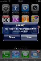
When you close the app (or your phone locks), your accounts can stay logged in up to half an hour, contingent on activating this in the options. You can see in the picture what happens when a message arrives. eBuddy tells you who sent the message, and using what service. Like when text messages arrive, you get the choice to ignore it or to deal with it. Messages will accumulate until you open the app. Beware, though, once you close the app messages disappear; there's no logging.

All in all, this is a good solid app, especially for a first release. I'd like to see push work for more than half an hour after logout, but that's a minor thing, for me anyways. One thumb up for concept and one thump up for execution.

Edit: I forgot the best part. It's completely free. No ads, not crippleware, not a lite version.

Tuesday, June 23, 2009

Stargazing Apps

Planets, Distant Suns, and Angle nicely compliment one another to assist in amateur stargazing.

The other night, I was out in a relatively cloud-free area looking upwards, and wondered which stars were which. I started out with the app Planets, which gives a nice view of what should be in the sky. It has markings to help determine azimuth and elevation. Notice that East and West are flipped. When you hold the phone face-down, it flips them for you so when you look up, everything lines up properly. At the time I was using it, the moon was in the sky, so I was able to use the app to find North and orient myself to be able to use Distant Suns. Planets does a couple of other cool things as well: it shows the Sun's illumination of the Earth and it shows the times of the rise and fall of the major celestial bodies.

Distant Suns (I used the Lite version) is a more advanced starfinding tool. The display is a bit more busy, but it gives a lot more information. I turned off a lot of the features so all I was shown were the stars and planets and constellation names. Using Angle find a star's elevation and estimating azimuth (I figured out which tree was closest to north and guessed from there) I was able to find three bright stars that lined up. Finding those stars enabled me to find other stars around them, and so on. I used Distant Suns (which was originally released in '89, according to the authors) to identify stars, constellations, planets, and so on. It was a very cool night. The app has a lot more functionality, but without a telescope in the middle of a brightish city, most of it was lost on me.

Angle is a very simple app that measures the angle between the left edge of the iPhone and the ground. Held right, if you sight along the right edge you can measure the elevation of a star. It's a simple app that does one thing well. The feature that makes it work is tapping the dial locks the display. Sight, tap, read. No need to hold it steady to get a good reading.

I highly recommend anybody who lives in an area where stars are visible (I'm in the middle of a big city and I could see them) to download and use these three apps. They're all bug-free (as far as I could tell) and fairly easy to use. Distant Suns took a bit of messing around with to get the hang of it, but it uses the typical iPhone-style controls: pinch, drag, &c.

All apps get two thumbs up: one for concept and one for execution. If you get the chance, download these three apps and head out at night to look at the stars.

LabTimer

LabTimer is a simple timer app.  It can count up, it can count down, and you'll know when the alarm goes off.  As you can see in the picture, the app features four separate timers, There's no switch to change between timer and stopwatch.  If you set a time, it's a timer, otherwise it's a stopwatch.  Each timer has a little icon above it to show what it's doing, and each can have a label set (in lieu of Timer N) to remind you what it's for.

For those not strapped for cash, check out LabTimer PhD and help out the developer.

All in all, a good solid app.  Thumbs up for concept, thumbs up for execution.

Friday, June 19, 2009

iHudLite Update

iHUDisplay Lite has a new version in the App Store. The main feature improvement is that instead of the crowded speed-heading-altitude display, it's now possible to display only speed. This makes it much easier (and safer) to read while driving. I did, however, notice that the speed on my speedometer (which is digital) and the speed given by the app almost never agreed.

During steady driving, the speed was usually only off by a mile an hour or two, but during acceleration and deceleration the speed lagged by a couple of seconds. For this reason, this app should probably not be used as a primary speedometer, but would be handy for the person reading the map.

I neglected to mention in my older post that the app has a speed alarm. Basically you can set it to go off if the registered speed goes above a certain limit. Handy if you're a leadfoot. If you set it while stopped (you DO only mess with your phone while stopped, right?) it works pretty well. I noticed that when I changed settings while driving (in a very safe manner), the set speed for the speed alarm changed to whatever my speed was at the time. The alarm is quite loud, for the record.

The only other bug I noticed was in the placement of the Ad. During normal driving, it's not much of a problem, although it can be a small white box reflecting on your windshield. In the settings, though, at times the ad covers the "Done" button, which means you have to exit the app and restart it to get back to your speed. An annoyance, but how often do you change settings, anyways?

I've emailed the developers about the bugs, hopefully they'll be fixed in the next version.

Thursday, June 18, 2009

Software 3.0 and iHudLite Revisited

Yesterday, Apple released an update to their iPhone Software. In my day's use, the only features that have come in handy are spotlight and cut and paste. Eventually I'll get around to syncing a calender, and as soon as I find a free IM app that uses push, you'll be the first to know.


Cut and paste work, for the most part. For user input fields, text selection is a breeze. For canned text on a webpage, like in the image to the right, it took a bit of effort to get that particular block of text selected. Originally it wanted to select the entire message, but I finally convinced it to let me select only part. I never could get the right (ending) selector to move.


Spotlight is nice, too. It'll find a lot of things on your phone, but it won't search through emails. It's great for finding a specific app among the eight pages of other apps you have. Apple also did a good job of making it easy to find; you can even set it up so that double-clicking the home button goes there, for those who prefer typing to swiping. Search happens in real-time, so there's no need to type a full name if you can narrow down what you want. Oddly enough, there's no landscape mode for this, although I've read nice things about it in other apps. I'm a portrait keyboarder, personally. My thumbs are small enough that I don't mind sacrificing width for a few more lines of view.


iHudLite has a new version out that fixes an annoyance of the previous version: the speed displayed was too small. I'll write more tomorrow, but for now, here are some pictures of the latest version.

Wednesday, June 17, 2009

iPhone 3.0 Software Available

Just a quick friendly reminder to update your phone to the new 3.0 software.  We get a lot of new features with this update.

Tuesday, June 16, 2009

Fone2Mouse


Fone2Mouse is an app that uses your iPhone as a networked mouse for a computer. It requires a program (the server) to be installed on the computer, but setup (at least on this Windows machine I'm using at the moment) was a breeze. The app even contains instructions on how to do this should you want to use a different computer. The app defaults to a three button trackpad.

There are plenty of cool options, but the only ones I could get working properly were a two-finger scroll and the ability to change the number of buttons. The app is only at version 1.0, however, so look for improvement in the future.
There are plenty of other options, such as the use of the accelerometer to move the mouse and to gestures to emulate arrow keys.

As it works over the network, your phone and computer will either have to be on the same wifi-enabled LAN, or your computer will have to have a public (not behind a router) IP address. Pointer movement is a bit reminiscent of a VNC session, but hey, if you need a trackpad, you need a trackpad.

I can invision using this app to perhaps flip through slides in a presentation, or maybe play a practical joke on someone who has left their computer unintended. Of course, if your mouse breaks, this can be a lifesaver until you can get a new one. Don't expect to win any Halo championships, however.

For concept, I give this app a thumbs up, but for execution, a sideways thumb for all of the broken features. I'll email the developers to see whether they have a fix in the pipeline and post here later about that.

Besides those mentioned above, what uses do you have for a networked mouse?

Monday, June 15, 2009

Bumpchat


Bumpchat is an app in the Social Networking category that connects users across the globe. It sells itself as a "location based messaging and dating app for the iPhone."

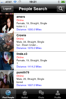
The application is reminiscient of Skype's SkypeMe mode, minus all of the spam. Users list their age, sex, height, and other info (all on a voluntary basis) in their profile, and add a picture of themselves. The main search page, pictured here can be filtered by most of the profile attributes to only list, say, 23 year olds with a picture living within a 100 mile radius.

What this all amounts to is a way to chat with random people in a slightly less anonymous manner than when using the Zen Jar. The app is kinda geared towards dating, but its been my experience that there are just as many people just wanting to have a chat as those looking for dating and other such things.

Now for the bad:
The interface is unlike any other iPhone app I've used. It looks like it is geared towards a computer, and not an iPhone. It doesn't autocapitalize, have autocorrect, or properly use accented characters. It does, however, seem to send Chinese characters fine. Crashes are common, and chat history seems to randomly disappear, as do contacts in the Hotlist, which amounts to a buddylist or a favorites list.

Filters seem to work mostly well, but occasionally filters out too many people. Server disconnects are common, even though network connectivity is fine.

Image distortion is another problem. Images can be sent in chats as messages, but unless they're just the right side, they're distorted to make them fit. Images taken by the iPhone's camera get squished.

I give this app a thumbs up for concept, and a thumbs down for execution.

Edit: On further inspection, it seems my Chinese did not work.

Wednesday, June 03, 2009

iPushupCounter


iPushupCounter is a very simple app which counts push-ups. Each time you tap your nose or chin (or anything, really) on the screen, a counter is incremented. The record high is also displayed.

This app doesn't do anything particularly unique, in and of itself. The instructions are pictographic, which is nice, and the graphics are pretty for a simple counter, but it leaves potential bells and whistles unimplemented. Something to time the duration of each set would be nice, or something to measure the rate of push-ups could do, too.

This app set out to count pushups, and does just that. No frills, just counting. Two thumbs up: one for concept, one for execution.

Tuesday, June 02, 2009

iHUDisplay lite

iHUDisplay lite is a fairly simple app which projects a car's speed, heading, and altitude onto the windshield (or any other reflective surface).

I've not done any checking into it, but at a glance it seems to use successive position updates to calculate the speed and heading. I'd guess it retrieves altitude from a server somewhere.

Speed and heading seem to be fairly accurate and reasonably close to real-time. Altitude lags a second or so.

The app sports two other indicators on its main display: a graphical indication of satellite connection status to let you know at a glance whether it's receiving GPS updates, and a speed indicator dial which is more or less unreadable when the phone is placed on the dashboard.

The main selling point of this app is that the display can be flipped mirror-image style to project from the dash to the windshield so you can see your speed and heading while driving. I found that during the day it was pretty useless, when it was getting dark that I hand to turn the brightness all the way up, and when it was dark I had to turn down the brightness so it would be less distracting.

On the subject of distraction, I found it best to position the iphone such that the display is dead center when I was looking forward. It was nice being able to check my speed and still retain peripheral vision. It took a second to focus on the numbers, but no longer than on a speedometer.

My only real gripe about the app is that the numbers are too small. Perhaps in a future release the authors will give us the option to turn off altitude (who cares?) and the tiny speed dial, and have the numeric readouts for speed and heading displayed in a much larger font. On the other hand, it was free; I'm not complaining.

The app also has settings to warn if a speed camera is nearby. I didn't get any results, but I'm also not aware of any speed cameras in my area. Assuming this works, it would be very handy for road warriors out there.

This is a nifty little app for drivers or those wanting to impress their friends in the car. Who knows, it could even help in avoiding wrecks. The concept of speed and heading displayed on the windshield seems to me to be very practical and easy to implement. I give the app a thumbs up for concept an a sideways, neutral thumb for execution.

Monday, June 01, 2009

PandoraBox

The two main functions of PandoraBox are to find apps which have been discounted and to provide a list of new apps.

For both discounted and new apps it is possible to select only free ones and to filter the list by category. This is handy, for example, if you only want to find free games.

Another nice feature is the ability to add apps to a favorites list to quickly see whether certain apps have been discounted.

PandoraBox also adds a search function which updates the list of results in real time as a search string is entered.

This is definitely a handy app for the cash-strapped and appaholics. I give this app a thumbs up for concept and a thumbs up for exceution.


It is very nice to find free apps, but don't be a penny pincher. The developers who write these apps generally do a good job with them - don't put them out of a job.

Welcome and First Pick

Welcome to the blog.

Here you will find reviews of the best (free) apps for the iPhone. Without further ado, our first application pick is the Zen Jar and the Zen Jar's free version.

The Zen Jar provides a medium for the anonymous exchange of ideas amongst its users. Initially, a user taps the Compose control to write a message. The message can be anything at all, but usually takes the form of a question or short statement. Just for the sake of example, I'll write "Anonymous exchange promotes rapid development of ideas." After the message is written, it is put in the Zen Jar for someone to read and optionally send back a reply. Replies pop up as they're received (provided a message is not being composed). It seems there's some rate limiting, but not too much to detract from the app.

My message got one reply:
"Very good point!"

Next to the Compose control is the Receive control. This control retrieves someone else's message from the Jar. Once a message is retrieved, there's the option to either return back to the jar or reply, which is accomplished by tapping on the message, adding a bit at the top, and tapping send. This reply is not distributed to the public but rather sent to the author, who in turn has the chance to reply, and so on. Whole conversations can take place.

I retrieved three messages:
"What's troubling you? I'm here to listen :)"
"What state are you in?"
"If you had one wish, what would it be?"

I give this application two thumbs up: one for concept and one for execution.